OHLC and HLC Bar Charts

An OHLC Bar Chart
Bar charts are one of the most popular forms of stock charts and were the most widely used charts before the introduction of candlestick charts. Bar charts are drawn on a graph that plots time on the horizontal axis and price levels on the vertical axis. These charts provide much more information than line charts as they consists of a series of vertical bars that indicate various price data for each time frame on the chart. This data can be either the open price, the high price, the low price and the close price, making it an OHLC bar chart, or the high price, the low price and the close price, making it an HLC bar chart. The height of each OHLC and HLC bar indicates the price range for that period with the high at the top of the bar and the low at the bottom of the bar. Each OHLC and HLC bar has a small horizontal tick to the right of the bar to indicate the close price for that period. An OHLC bar will also have a small horizontal tick to the left of the bar to indicate the open price for that period. The extra information is one of the reasons why the OHLC charts are more popular than HLC charts. In addition, some charting applications use colors to indicate bullish or bearishness of a bar in relation to the close of the previous bar. This makes the OHLC bar chart quite similar to the candlestick chart, except that the OHLC chart does not indicate bullishness or bearishness of the period of one bar as clearly as the candlestick chart (the color of an OHLC bar is always in relation to the close of the previous bar rather than the open and close of the current bar).

An OHLC Bar
Most bar charts contain a lower pane that plots the total volume traded during a particular period. This part of the chart has a separate scale on the vertical axis to illustrate volume levels. It too consists of typical vertical bars.
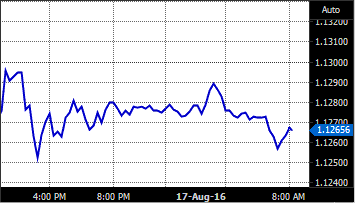
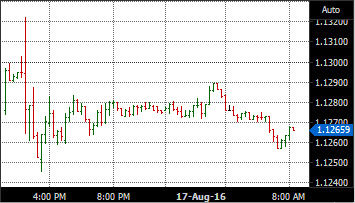
The following two charts of the EUR/USD illustrate the differences between line and bar charts in terms of the amount of information each one parts. First is the line chart that only plots the close price of the underlining security and the second is the OHLC bar chart. Both charts have a 15-minute time frame and cover the exact same period.

A Line chart of the Euro/USD

A Bar chart of the Euro/USD